 |
European Foundation |
The tripartite EU agency providing knowledge to assist |
|
European Foundation |
The tripartite EU agency providing knowledge to assist |
The new Eurofound website design is based on Bootstrap 4, a free front-end framework for faster and easier web development
Bootstrap includes HTML and CSS based design templates for typography, forms, buttons, tables, navigation, modals, image carousels and many other, as well as optional JavaScript plugins. Bootstrap also gives you the ability to easily create responsive web designs.
Bootstrap 4 supports the latest, stable releases of all major browsers and platforms. However, Internet Explorer 9 and down is not supported.
Advantages of Bootstrap:
Bootstrap includes a responsive, mobile first fluid grid system that appropriately scales up to 12 columns as the device or viewport size increases.
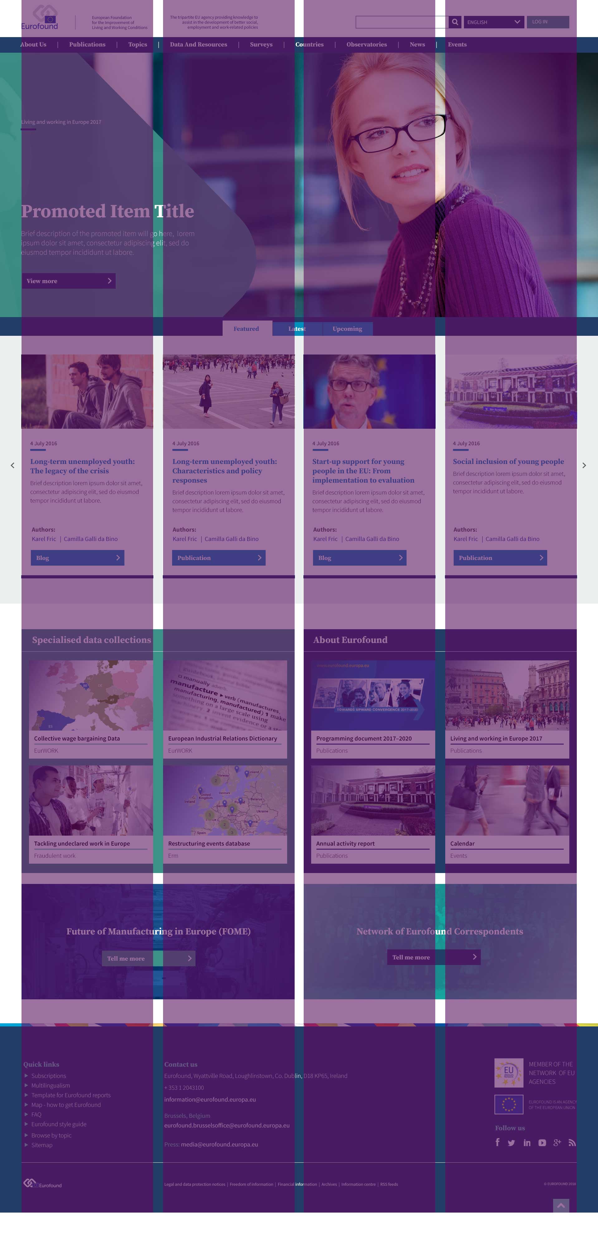
The homepage is designed to display full screen. The Hero Image and footer both sit in a single column (spanning the full 12 columns) that display across the whole width of the screen. The other content is either 2 column (spanning 6 columns each) or 4 column (spanning 3 columns each) in width as demonstrated below.

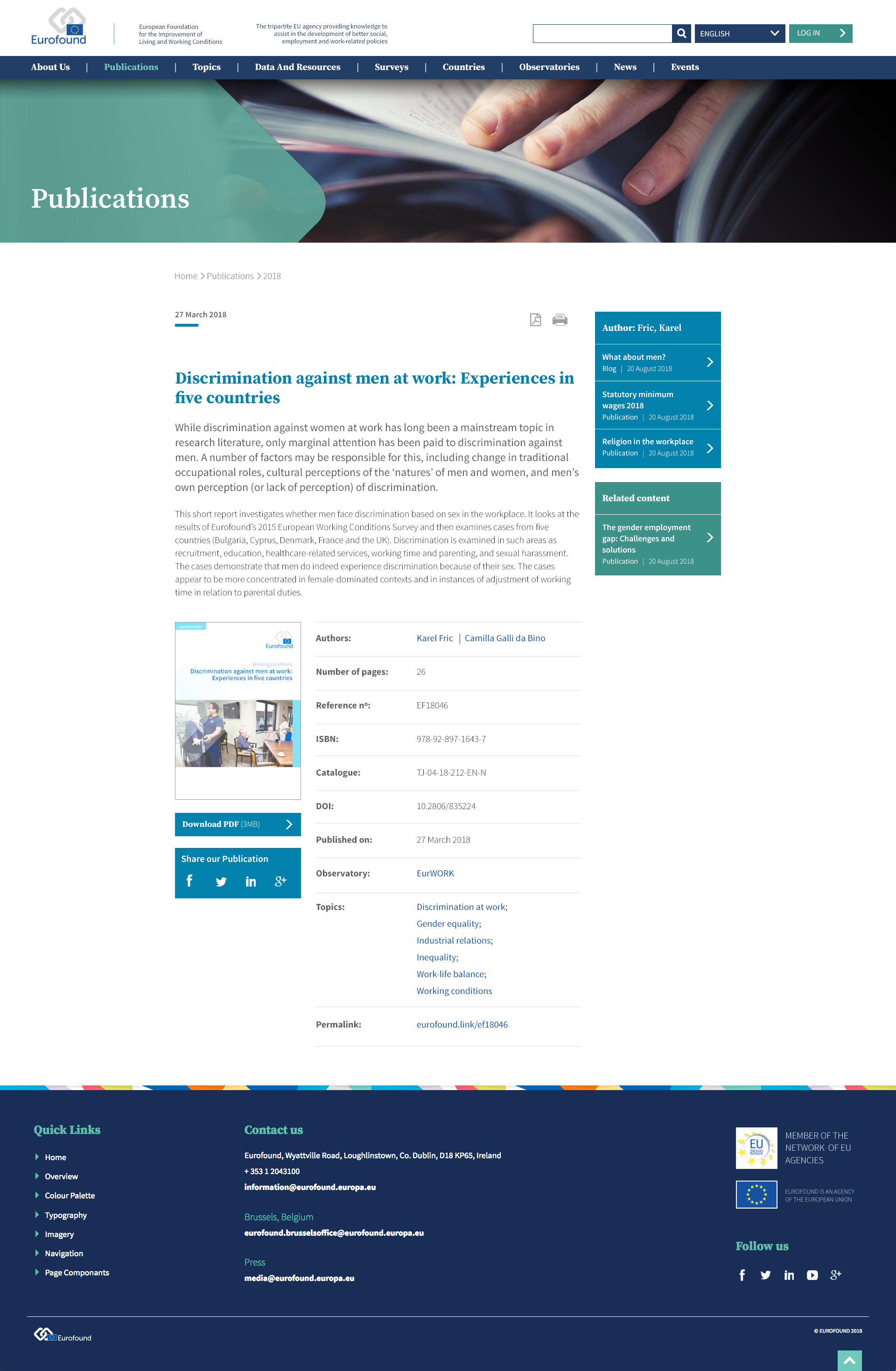
Whilst the homepage utilises a one, two and four column setup across the full width of the screen, the inner pages are laid as single column within a 1170px wide wrapper. If a secondary navigation menu is required, this sits to the left of the main content in a 3 column/9 column setup. When additional link boxes are required – eg: Related content or Author information boxes – this sits to the right of the main content in a 9 column/3 column setup as shown below.
The Bootstrap grid system is mobile first, meaning that the page designs can easily be scaled across multiple devices.
